
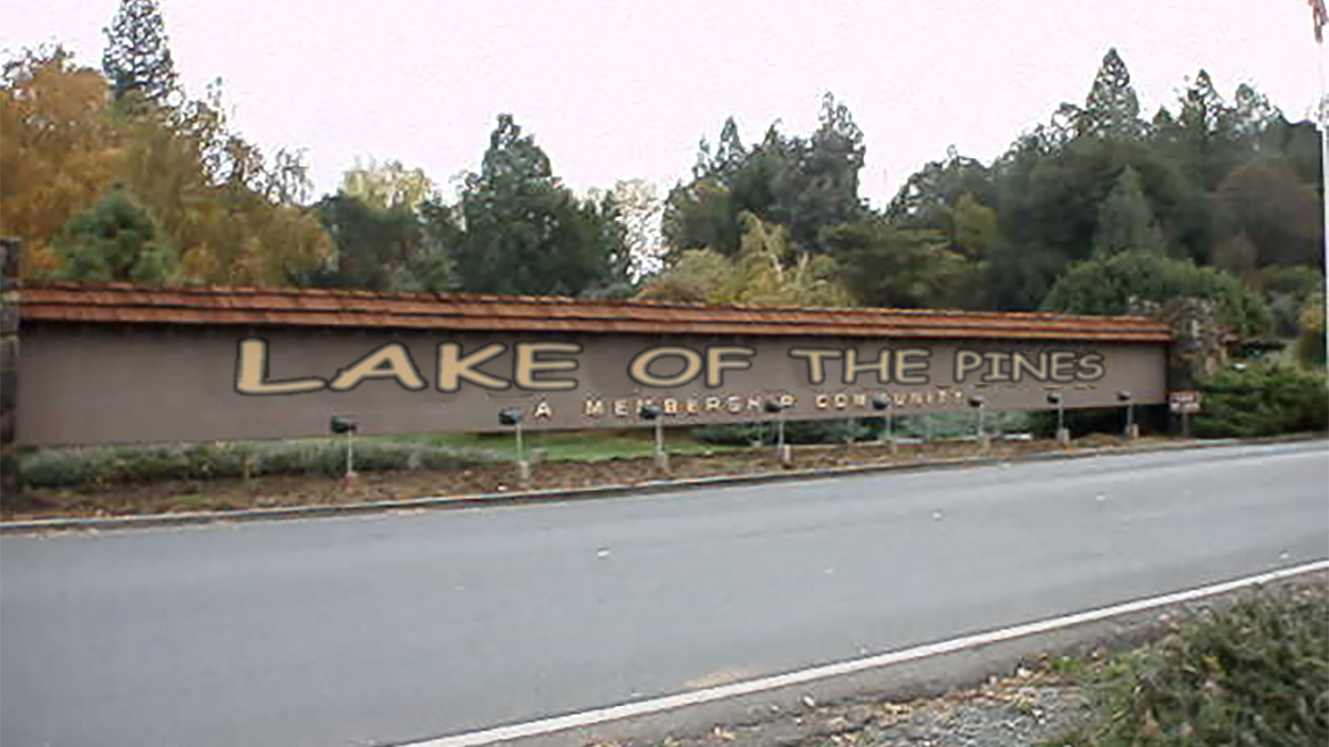
Lake of the Pines, CA — The gated residential community Lake of the Pines (LOP) in Nevada County, California, wanted to show surrounding towns and developments that it “knows how to party and lighten-up” this week by proposing a change in bylaws font from the conservative Arial typeface to a whimsical and highly controversial Comic Sans one.
The font change, which has been in the works for several months now, took the effort of 4 lawyers, a “community action network” of over 100 LOP residents, and the board of directors’ approval, which is planned to take effect sometime in 2016.
“I have no idea what’s this about,” said area transplant, Lake of the Pines resident and current commuting Chevron employee Wes Ford from the porch of his Lakeshore Drive home. [Note Gish Gallop was instructed not to come onto his property] “There’s been a lot of weird stuff going on here recently. First, Pynchon guy who doesn’t talk to anybody, and now this font changes on our bylaws. Who gives a damn about any of this?”
Comic Sans font is a sans-serif casual script typeface designed by Vincent Connare and released in 1994 by Microsoft Corporation. Since its release, it has been generally considered the “Nickelback” of fonts named after the same name’s horrible band.
It’s unclear when the font became the target of great ridicule. Still, some critics cite its ubiquity in the Window Operating System, starting with Windows 95, which made it arguably the world’s most popular typeface. Generally, people who have no idea what they’re doing use the controversial font in important documents such as the Lake of the Pines bylaws, which makes them seem like dumbasses or a 12-year-old girl.
“The history of the Comic Sans font is not a positive one,” said Robert Colvin of the Rundex Family Foundation who was commissioned by the Lake of the Pines Board of Directors to study the impact of a font change on the community’s bylaws. “The font tends to highlight one’s lack of understanding in typographic. It appeals to our lower and more base impulses. Some sociologists have commented that it tends to illustrate how people lack empathy for their readers, choosing whimsy over communication. I advised them[LOP] not to use it if their goal was looking ‘connected’ to the surrounding community.”
According to LOP insiders, if this Comic Sans application improves the perception that its residents are not hiding in bunkers waiting for the end of the world, promoters plan to convert the organization’s website to the controversial font. The website conversion will take upwards of 3 years after its been vetted by the various architectural committees.


